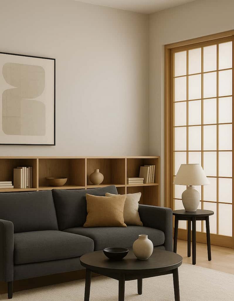
When people think of Japandi interiors, they often picture pale oak cabinetry, neutral walls, and a linen sofa beside a washi lamp. But beneath that surface calm lies a story centuries old — a story written in brushstrokes, woodblock prints, and hand-painted design books.
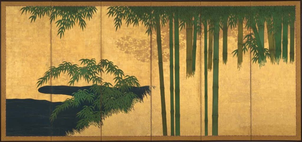
Japanese art has long been a masterclass in restraint, seasonality, and symbolism. The same qualities that make ukiyo-e prints or ink sketches timeless also make Japandi interiors so harmonious. By tracing Japandi palettes back to Japanese art — from the illustrated manuals Tansui Gafu (1817) to the decorative design books Shin Bijutsukai (1901), to iconic works like Hokusai’s Great Wave — we uncover a hidden lineage.
Below are eight Japandi-friendly palettes, each with roots in Japanese art. These palettes don’t just look beautiful; they carry stories of waves, grasses, blossoms, bamboo, cranes, maples, and lotus ponds — stories you can live with at home.
Why Japanese Art Inspires Japandi Color Palettes
Scandinavian design gives Japandi its warmth, its hygge. Japan gives it its poetry.
Traditional Japanese pigments were more than colors — they were symbolic:
- Ai (Indigo) protected against insects and symbolized calm.
- Shuiro (Vermilion) was a life-affirming shade used on shrine gates.
- Matsuba-iro (Pine Green) evoked resilience.
- Gofun White, made from crushed oyster shells, suggested purity.
Works like Tansui Gafu — a Japanese painter’s model book — captured grasses, flowers, and birds in precise ink lines, offering generations of artists and artisans visual “modules.” A century later, Shin Bijutsukai, edited by illustrator Furuya Korin , presented dazzling Art Nouveau–inflected Japanese design plates — waves, scrolls, florals — meant as inspiration for textiles and interiors.
These books weren’t abstract — they were manuals for living with art. And today, they can inspire our Japandi interiors in the same way.
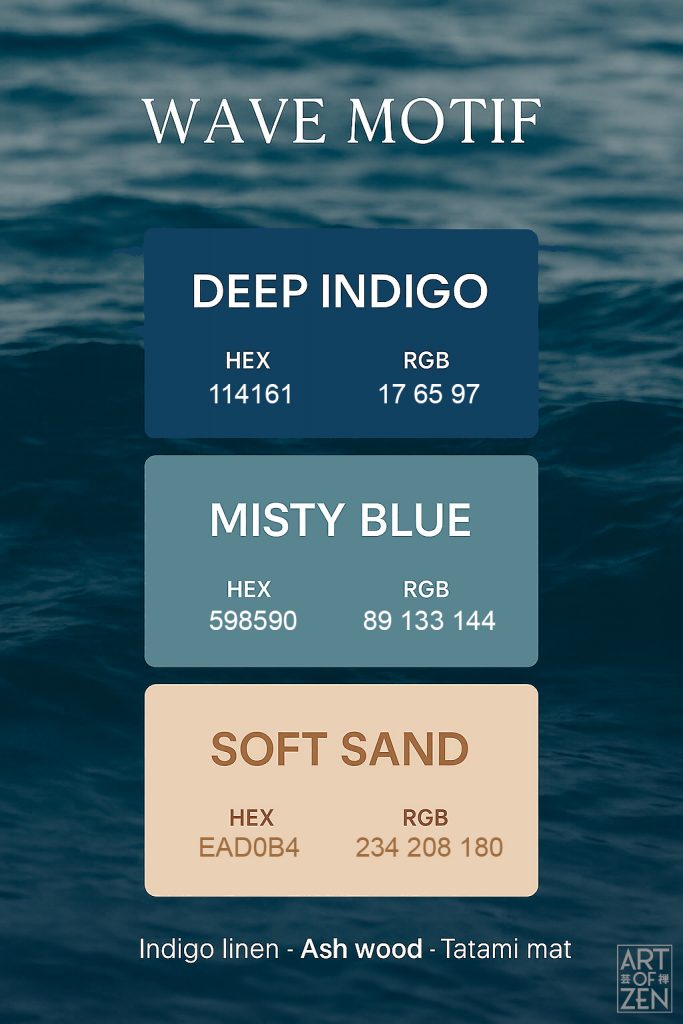
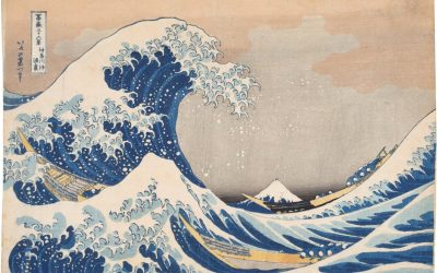
Palette 1: Wave Motif 🌊
- Deep Indigo — #114161 (R17, G65, B97)
- Misty Blue — #598590 (R89, G133, B144)
- Soft Sand — #EAD0B4 (R234, G208, B180)
Art Source: Katsushika Hokusai’s The Great Wave off Kanagawa (Thirty-Six Views of Mount Fuji, 1831).

The Great Wave is arguably the most recognized Japanese image in the world. Its towering indigo crest, frothing white spray, and soft sandy sky embody both drama and calm. The deep blue was made possible by imported Prussian Blue pigment, a new technology in Hokusai’s day that revolutionized ukiyo-e color printing.
Japandi Application:
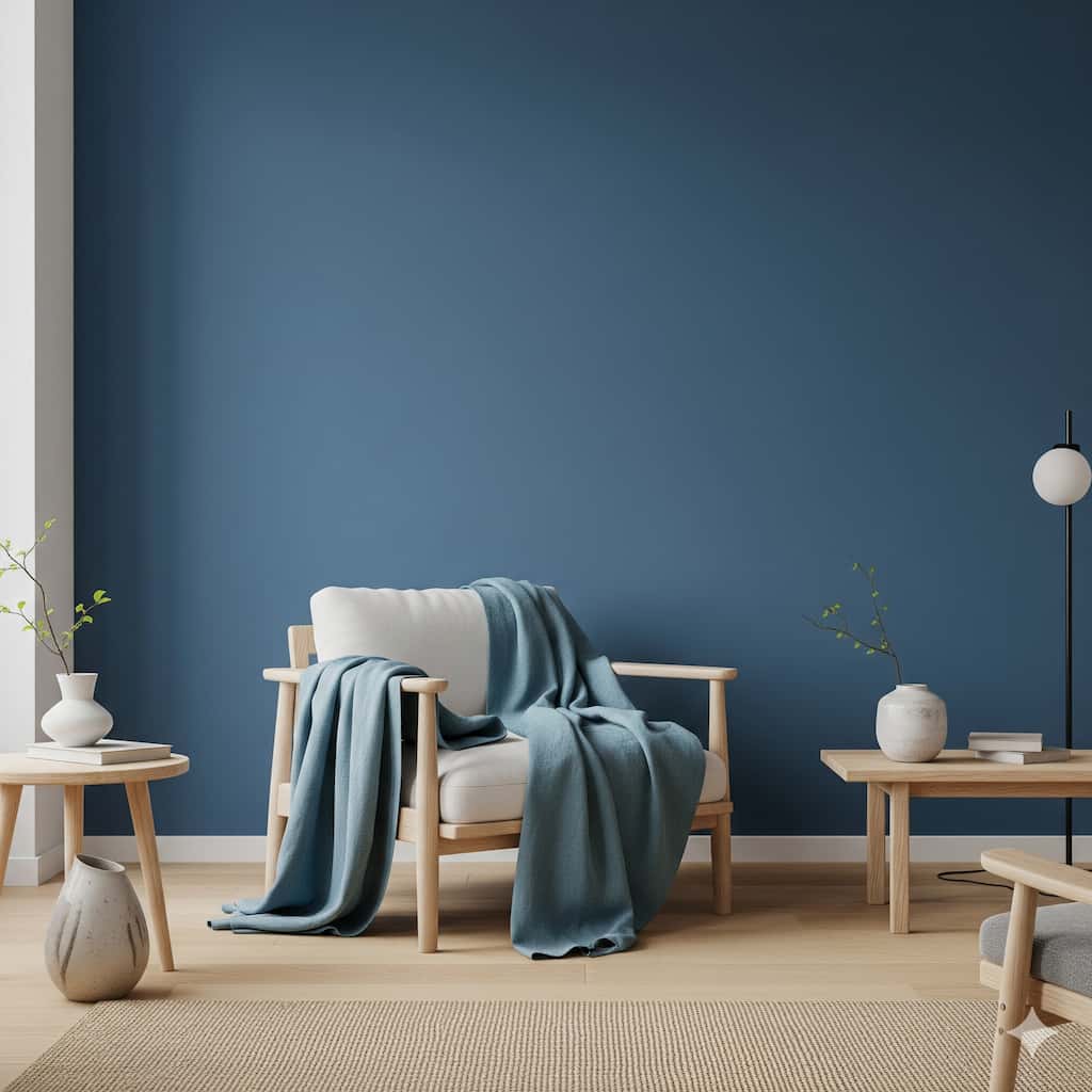
- Walls: Misty Blue to echo shifting light.
- Textiles: Indigo-dyed linen cushions or wall hangings.
- Floors: Soft Sand in tatami mat tones or pale rugs.
Together, they create a room that feels like breathing beside the sea — still, yet alive with movement.
Closest Paint Colors:
| HEX/RGB | Sherwin Williams® | Benjamin Moore® | BEHR® | |
| Deep Indigo | #114161 R17, G65, B97 | SW6510 | 2055 – 10 – Teal | N/A |
| Misty Blue | #598590 R89, G133, B144 | SW7614 | Csp-680 – Baltic Sea | S480 – 5 Blue Moon Bay |
| Soft Sand | #EAD0B4 R234, G208, B180 | SW0028 | 1108 – Chamois | S290-2 White Bean Hummus |
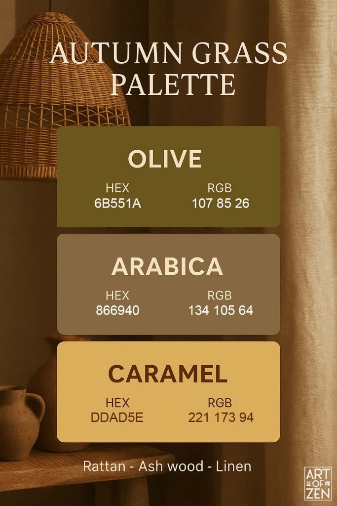
Palette 2: Autumn Grass 🍂
- Olive — #6B551A
- Arabica — #866940
- Caramel — #DDAD5E
Art Source: Tansui Gafu (1817), especially its plates of wild grasses swaying in ink strokes.
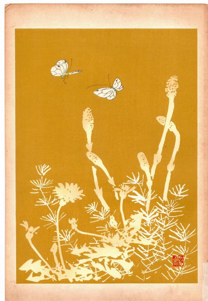
Japanese painters often depicted susuki (pampas grass) as a seasonal symbol of autumn. These grasses stand tall in moonlit scenes, paired with crickets or dew. In Tansui Gafu, the sketches were simple yet lyrical, showing how even a blade of grass could embody impermanence.
Japandi Application:
- Walls & Woodwork: Olive, grounding pale oak or ash cabinetry with depth.
- Accents & Textiles: Arabica, in wool throws, cushions, or rattan tones for warmth.
- Highlights: Caramel, echoing autumn sunlight in ceramics, lampshades, or accent chairs.
This palette is autumn in interior form — mellow, grounded, and rich in natural poetry.
Closest Paint Colors:
| HEX/RGB | Sherwin Williams® | Benjamin Moore® | BEHR® | |
| Olive | #6B551A R107, G85, B26 | N/A | 237 – Silken Moss | N/A |
| Arabica | #866940 R134, G105, B64 | SW6125 | Es-10 – Natural | Ppu4 – 18 – Spice Bazaar |
| Caramel | #DDAD5E R221, G173, B94 | SW6669 | 1108 – Chamois | 310d-5 Sahara Shade |
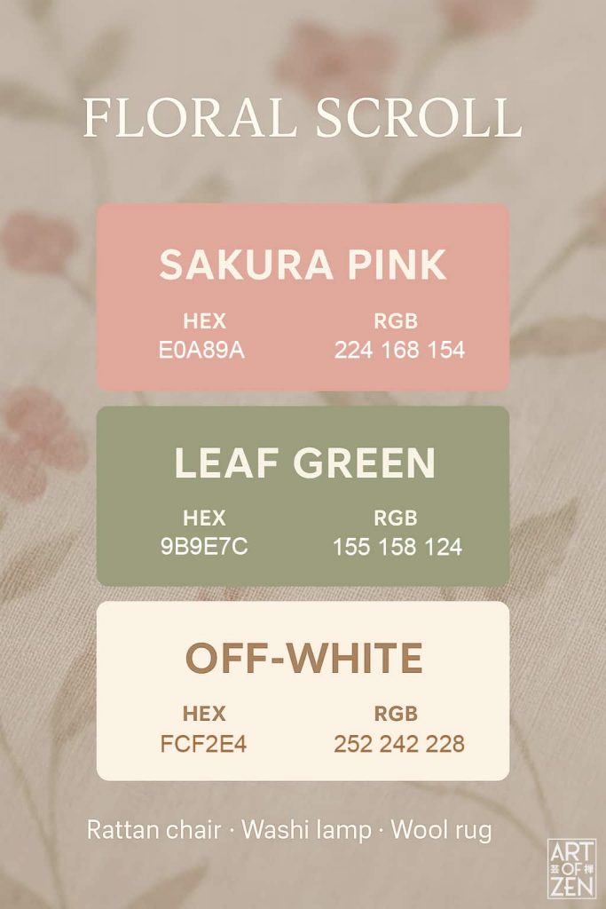
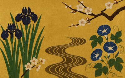
Palette 3: Floral Scroll 🌸
- Sakura Pink — #E0A89A
- Leaf Green — #9B9E7C
- Off-White — #FCF2E4
Art Source: Shin Bijutsukai (1901), floral design scrolls influenced by Rinpa school stylization.
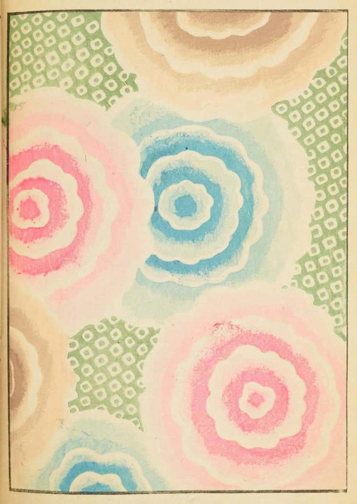
Spring in Japan has always been synonymous with cherry blossoms. The pink of sakura petals, set against pale washi and fresh green leaves, was a favorite motif for textile designers. Shin Bijutsukai modernized this imagery, blending Japanese motifs with Art Nouveau curves for the Meiji era.
Japandi Application:
- Ceramics: Sakura Pink glaze in small bowls.
- Lighting: Off-White washi lampshades.
- Accents: Leaf Green woven into rugs or art prints.
The result is freshness: a spring breeze translated into Japandi interiors.
Closest Paint Colors:
| HEX/RGB | Sherwin Williams® | Benjamin Moore® | BEHR® | |
| Sakura Pink | #E0A89A R224, G168, B154 | N/A | 031 – Georgia Peach | Pmd-70 Cottage Rose |
| Leaf Green | #9B9E7C R155, G158, B124 | SW2812 | Af-405 – Thicket | Bic-57 French Parsely |
| Off-White | #FCF2E4 R252, G242, B228 | SW7104 | 2157-70 Ivory Tower | Pwl-81 Spice Delight |
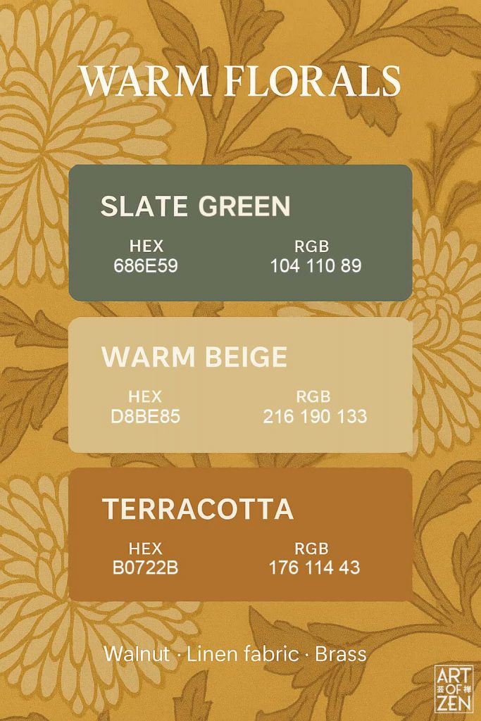
Palette 4: Warm Florals 🌼
- Slate Green — #686E59
- Warm Beige — #D8BE85
- Terracotta — #B0722B
Art Source: Floral textile patterns and printed kimono designs in late-Edo and Meiji Japan.
While spring blossoms were bright, other floral depictions leaned earthy: petals muted by dusk, blossoms fading into warm clay tones. Terracotta recalls Japanese kawara roof tiles and Bizen pottery, grounding florals in earth.
Japandi Application:
- Walls: Slate Green for depth and calm.
- Upholstery: Warm Beige linen.
- Accents: Terracotta in pottery, floor tiles, or cushions.
This palette warms Japandi’s minimalist restraint, adding comfort without clutter.
Closest Paint Colors:
| HEX/RGB | Sherwin Williams® | Benjamin Moore® | BEHR® | |
| Slate Green | #686E59 R104, G110, B89 | SW6166 | 1561 – Castle Peak Gray | N390-6 Laurel Garland |
| Warm Beige | #D8BE85 R216, G190, B133 | SW6401 | Af-345 – Honeymoon | Mq2-18 Honey Tea |
| Terracotta | #B0722B R176, G114, B43 | SW7709 | 2166-10 – Gold Rush | S-h-320 Enchanting Ginger |
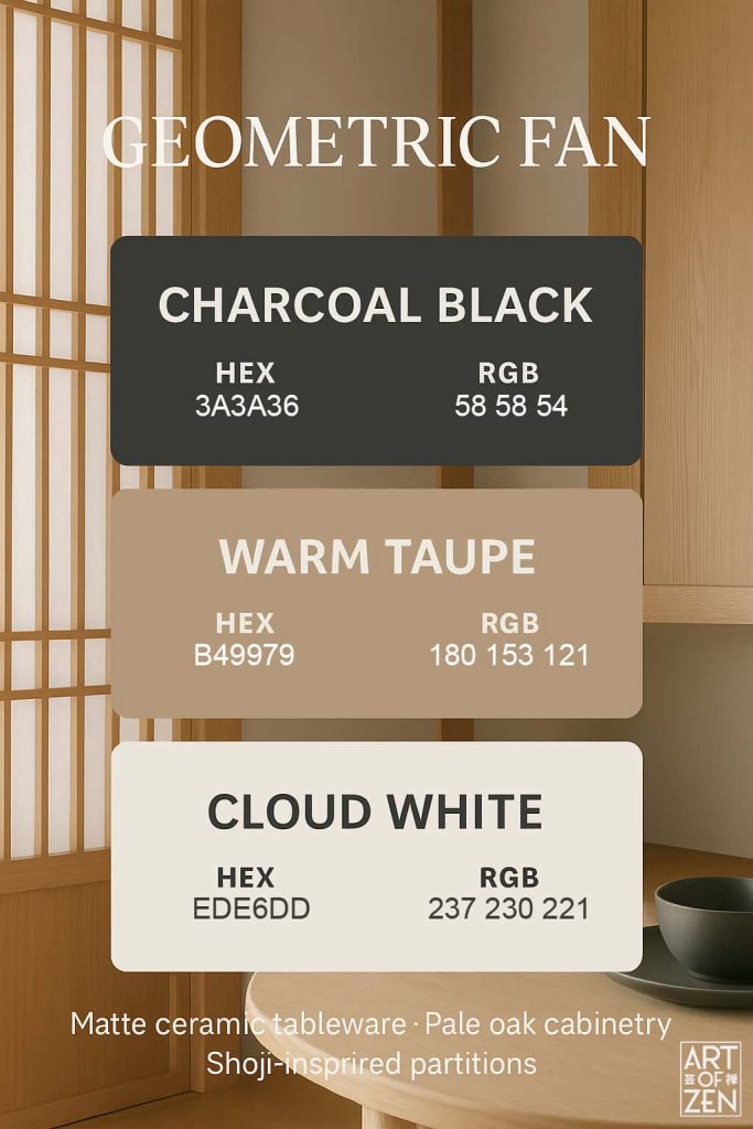
Palette 5: Geometric Fan 🌀
- Charcoal Black — #3A3A36
- Warm Taupe — #B49979
- Cloud White — #EDE6DD
Art Source: Folding fans (ōgi) depicted in Rinpa and ukiyo-e prints; also Shin Bijutsukai’s bold geometric fan designs.
The folding fan is both functional and ornamental. In Rinpa screens, fans floated across gold-leaf backdrops. In Shin Bijutsukai, they became abstract patterns, sharp yet airy.
Japandi Application:
- Furniture: Charcoal Black steel legs or matte ceramics.
- Cabinetry: Warm Taupe oak veneer.
- Walls: Cloud White plaster.
The palette emphasizes Japandi’s love of geometry — minimalist but not sterile, with rhythm and breath.
Closest Paint Colors:
| HEX/RGB | Sherwin Williams® | Benjamin Moore® | BEHR® | |
| Charcoal Black | #3A3A36 R58, G58, B954 | SW6216 | 2128-10- Black Beauty | Mq5-05 Limousine Leather |
| Warm Taupe | #B49979 R180, G153, B121 | SW9097 | 1083 – Beach House Beige | 280f-4 Burnt Almond |
| Cloud White | #EDE6DD R237, G230, B221 | SW7101 | 878 – Mauve Hint | Rd-w07 Cave Pearl |
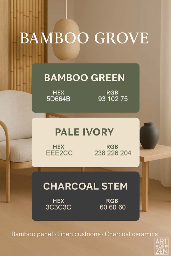
Palette 6: Bamboo Grove 🎋
- Bamboo Green — #5D664B
- Pale Ivory — #EEE2CC
- Charcoal Stem — #3C3C3C
Art Source: Zen ink paintings of bamboo; also Tansui Gafu’s bamboo sketches.
Bamboo symbolizes resilience. Its vertical rhythm and soft green leaves were sketched endlessly by Zen monks and artists. In ink paintings, a few strokes could conjure entire groves swaying in silence.
Japandi Application:
- Walls: Pale Ivory for brightness.
- Accents: Bamboo Green in textiles or plants.
- Structure: Charcoal Stem for furniture frames and decoration.
A palette that feels alive, upright, and centered.
Closest Paint Colors:
| HEX/RGB | Sherwin Williams® | Benjamin Moore® | BEHR® | |
| Bamboo Green | #5D664B R93, G102, B75 | SW6180 | 455 – Sweet Basil | 410f-7 Fiddle Leaf |
| Pale Ivory | #EEE2CC R238, G226, B204 | SW2829 | 1149 – Gentle Repose | Qe-17 Ivory Stone |
| Charcoal Stem | #3C3C3C R60, G60, B60 | SW6988 | 2120-20 – Black Iron | Mq5-05 Limousine Leather |
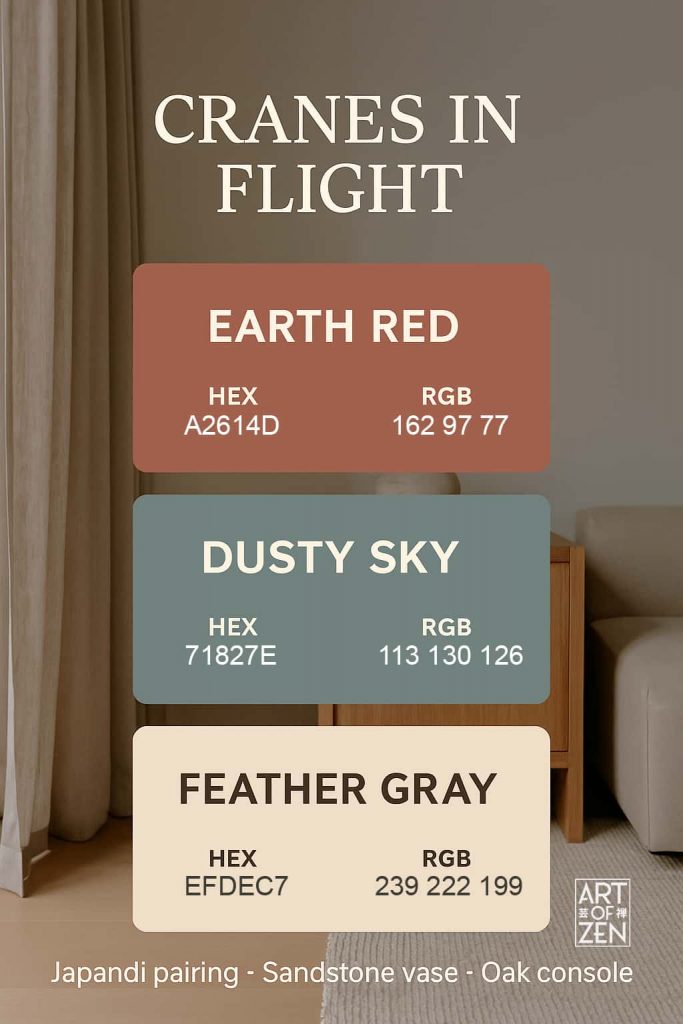
Palette 7: Cranes in Flight 🕊️
- Earth Red — #A2614D
- Dusty Sky— #71827E
- Feather Gray — #EFDEC7
Art Source: Cranes in folding screens and ukiyo-e prints, such as those by Utagawa Hiroshige.
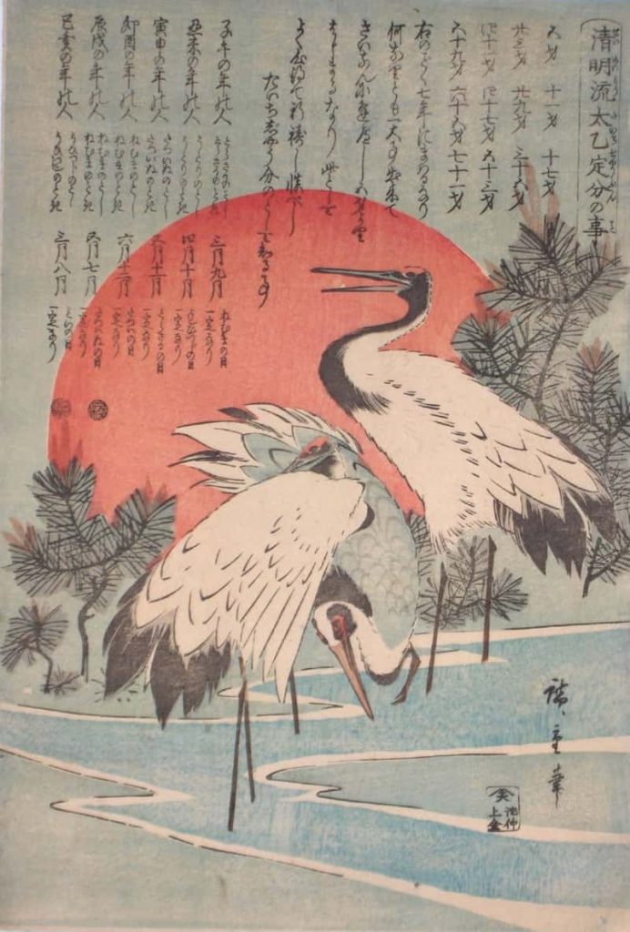
The crane (tsuru) symbolizes longevity and fidelity. Often depicted flying in flocks over pale landscapes, their white feathers, grey shadows, and red crests became a recurring motif in Edo art.
Japandi Application:
- Walls: Feather Gray to maximize light.
- Textiles: Dusty Sky in rugs or wool throws.
- Accent: Earth Red sparingly in cushions or ceramics.
Minimalism with a heartbeat — this palette suggests movement within stillness.
Closest Paint Colors:
| HEX/RGB | Sherwin Williams® | Benjamin Moore® | BEHR® | |
| Earth Red | #A2614D R162, G97, B77 | SW0040 | 1196 – Burnt Sienna | Ppu2-15 Cajun Red |
| Dusty Sky | #71827E R113, G130, B126 | SW0047 | 706 – Cedar Mountains | 720f-5 Hidden Peak |
| Feather Gray | #EFDEC7 R239, G222, B199 | SW6350 | 910 – Creme Caramel | Bxc-83 New Harvest Moon |
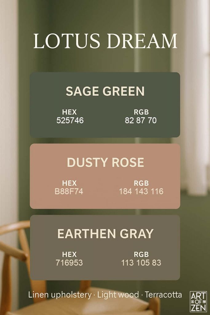
Palette 8: Lotus Dream 🌸
- Sage Green — #525746
- Dusty Rose — #B88F74
- Earthen Gray — #716953
Art Source: Buddhist-inspired lotus paintings and pond scenes.
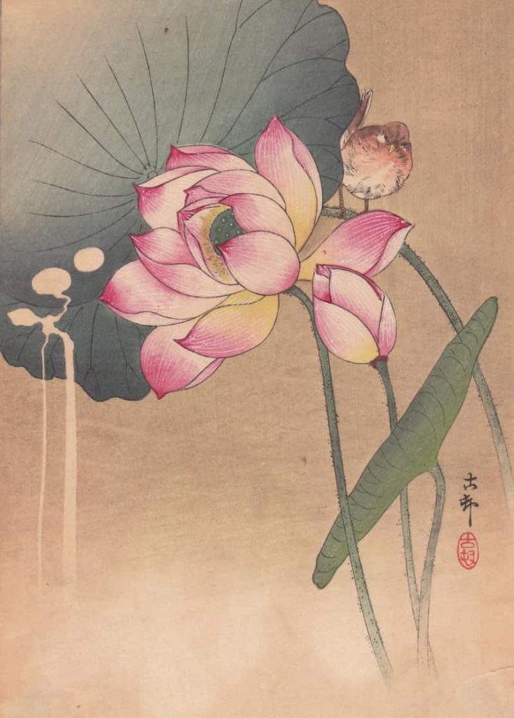
The lotus embodies purity rising above muddy waters — a metaphor that shaped Japanese art and architecture.
Japandi Application: Perfect for serene, bright interiors — ivory walls, pale oak, and subtle pink or green accents.
Closest Paint Colors:
| HEX/RGB | Sherwin Williams® | Benjamin Moore® | BEHR® | |
| Earth Red | #525746 R182, G987, B70 | SW0065 | 2140-20 Tuscany Green | Ecc-37-3 Freshwater Marsh |
| Dusty Sky | #B88F74 R184, G143, B116 | SW9104 | 1228 – Roman Shade | S230-5 Sugar Maple |
| Feather Gray | #716953 R113, G105, B83 | SW7040 | 1490 – Country Life | 770d-6 Sandwashed Driftwood |
How to Use These Palettes at Home
- Pick a Base Palette — Use one as the “core” for walls and furniture.
- Add Seasonal Layers — Rotate cushions, throws, or flowers seasonally.
- Mix Textures, Not Colors — Keep palettes simple but enrich with linen, bamboo, wool, and ceramics.
- Reference the Source — A framed ukiyo-e print above a palette-colored rug ties story to space.
Living with Art Inspired Colors
Japandi is not a surface trend. It’s the modern continuation of centuries of Japanese art. By drawing from Tansui Gafu, Shin Bijutsukai, ukiyo-e, and painted screens, we see that Japandi colors have deep roots in waves, grasses, blossoms, bamboo, cranes, maples, and lotus ponds.
To live with these palettes is to live with art — not in a gallery sense, but in the intimate, everyday sense Japanese culture has always embraced. These palettes don’t just color interiors; they color moods, seasons, and the quiet poetry of life.
Read More:
- Master the Ultimate Japandi Color Palette for a Tranquil Home Oasis
- 10 Steps to Create a Beautiful Japandi Home
- Key New Trends in Japandi Interior Design for 2025
- The 5 Most Known Ukiyo-e Artists of the Edo Period
- How to Design a Biophilic Home That Feels Like a Breath of Fresh Air
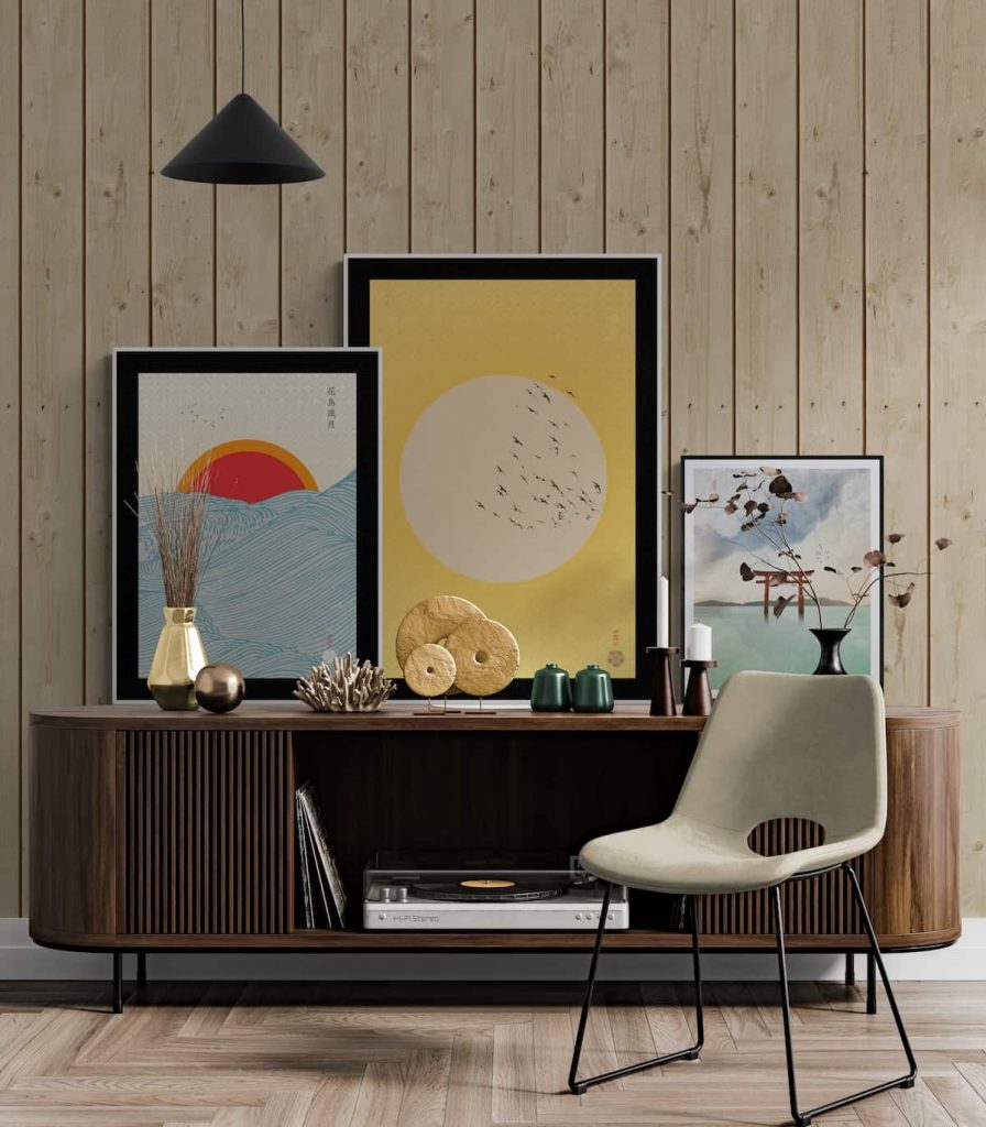
At The Art of Zen we carry a selection of our own hand-crafted original Japanese art prints in the ukiyo-e and Japandi style. Some of our best selling work is Mount Fuji wall art and Japandi wall art.
Add some zen to your space with brilliant original art from the Art of Zen shop.


0 Comments