Introduction
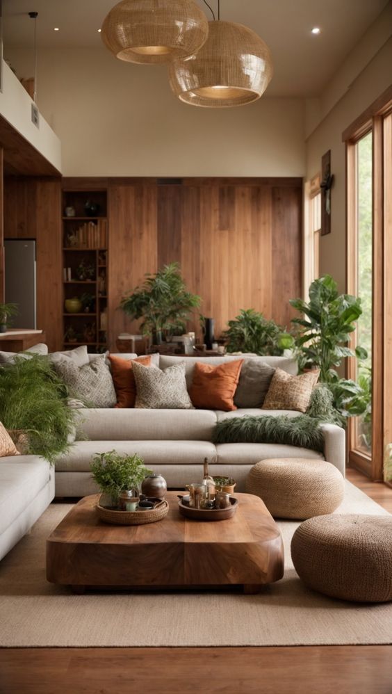
In the world of interior design, the Japandi style has emerged as a serene and sophisticated aesthetic that combines the minimalist principles of Japanese decor with the cozy warmth of Scandinavian design. At the heart of this fusion is a color palette that plays a crucial role in creating spaces that are both tranquil and inviting. The perfect Japandi color palette is a harmonious blend of neutral tones, subtle contrasts, and natural hues that evoke a sense of calm and elegance. In this article, we’ll explore the essence of the Japandi design style, delve into the nuances of its characteristic color palette, and take a detailed look at twelve colors that epitomize this unique aesthetic.
The Essence of Japandi Design
Japandi design is more than just a trend; it’s a philosophy that prioritizes functionality, simplicity, and connection to nature. This design style emphasizes clean lines, natural materials, and a muted color scheme to create spaces that are minimalist yet warm, blending the best of both Japanese and Scandinavian sensibilities. The Japandi color palette is carefully curated to enhance this sense of harmony and balance, featuring colors that are soft, earthy, and deeply rooted in the natural world.
Discover the Key New Trends in Japandi Interior Design for 2024.
The Japandi Color Palette
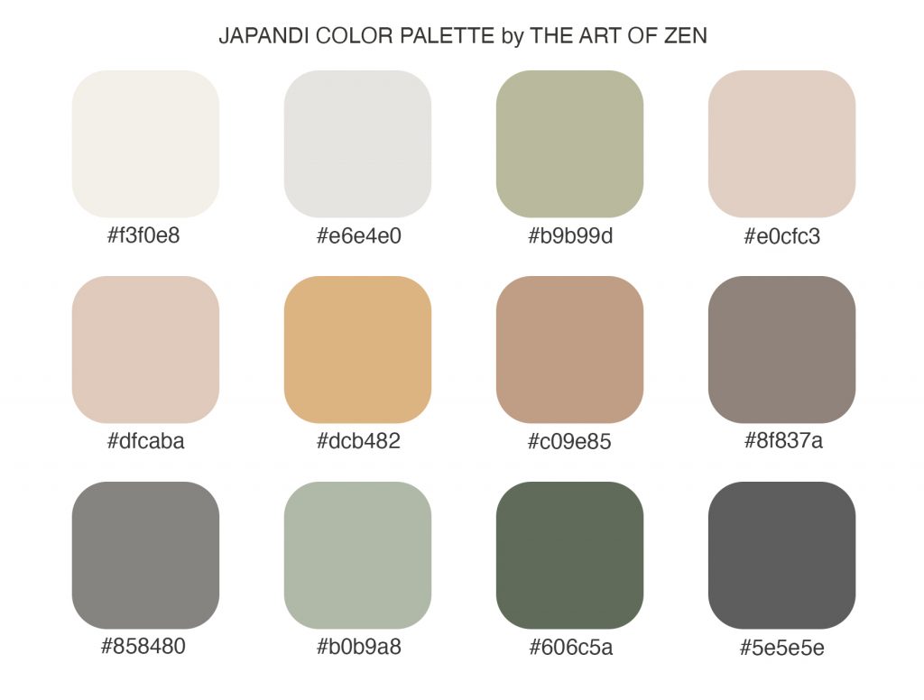
The Japandi color palette is a testament to the beauty of restraint and subtlety. It comprises shades that range from soft whites and greys to deeper, earth-inspired tones. Each color in the palette serves to create an atmosphere of peace and refined simplicity, aligning with the Japandi principles of minimalism and natural beauty. Let’s explore each of these colors in detail, examining their RGB representations and the unique qualities they bring to the Japandi style.
Creamy White (#f3f0e8)
RGB: (243, 240, 232)
Creamy White is a soft, warm white with a subtle hint of yellow. This color serves as a versatile backdrop in Japandi interiors, reflecting light to create a sense of spaciousness while offering a cozy warmth. It’s perfect for walls, large furniture pieces, and textiles, providing a serene and welcoming ambiance.
Soft Stone (#e6e4e0)
RGB: (230, 228, 224)

Soft Stone is a gentle gray with undertones of beige, embodying the Japandi aesthetic’s emphasis on muted elegance. This color is ideal for creating a soothing environment that feels both sophisticated and grounded. Use it in living spaces for upholstery, curtains, and rugs to add depth and tranquility.
Sage Green (#b9b99d)
RGB: (185, 185, 157)

Sage Green is a muted, earthy green that captures the essence of nature. This hue brings a touch of the outdoors into Japandi spaces, promoting a sense of calm and rejuvenation. It works beautifully with natural wood tones and can be incorporated through accents like cushions, vases, and wall art.
Blush Sand (#e0cfc3)
RGB: (224, 207, 195)

Blush Sand is a soft, warm hue that bridges the gap between pink and beige. It adds a subtle pop of color to the Japandi palette, offering a hint of warmth without overwhelming the senses. This color is perfect for textiles and decorative accessories, creating a cozy and inviting atmosphere.
Warm Taupe (#dfcaba)
RGB: (223, 202, 186)

Warm Taupe is a rich blend of brown and gray, exuding a sense of comfort and sophistication. This color is versatile and grounding, making it ideal for furniture, flooring, and wood elements that are central to the Japandi style. It pairs well with both light and dark hues, enhancing the overall sense of harmony.
Golden Straw (#dcb482)
RGB: (220, 180, 130)

Golden Straw is a warm, inviting shade that captures the golden hues of natural straw. This color adds a sunny, optimistic touch to spaces, reminiscent of sunlight filtering through a window. It’s particularly effective in textiles and accents, bringing a cheerful warmth to the minimalist Japandi aesthetic.
Earthy Clay (#c09e85)
RGB: (192, 158, 133)

Earthy Clay is a deep, warm terracotta color that embodies the natural elements central to Japandi design. This hue adds depth and character to spaces, evoking the raw beauty of earthenware. Use it in decorative elements, textiles, or as an accent wall to infuse rooms with a grounded, rustic charm.
Smoky Grey (#8f837a)
RGB: (143, 131, 122)

Smoky Grey is a sophisticated, deep grey with brown undertones, offering a stronger contrast in the Japandi color scheme. It’s excellent for creating focal points, whether through furniture, statement walls, or artwork. This color brings a modern edge to the natural palette, enhancing the contemporary feel of Japandi spaces.
Slate Grey (#858480)
RGB: (133, 132, 128)

Slate Grey is a balanced, medium grey that provides a cool counterpoint to the warmer tones in the palette. Its versatility makes it a staple for Japandi interiors, suitable for both large surfaces and detailed accents. It embodies the minimalist aspect of the style, offering a sleek, understated elegance.
Moss Green (#b0b9a8)
RGB: (176, 185, 168)

Moss Green is a soft, muted green with a hint of grey, reminiscent of moss-covered stones. This color reinforces the Japandi connection to nature, bringing a peaceful, organic feel to interiors. It’s particularly effective in soft furnishings and plants, enhancing the natural, calming atmosphere of Japandi spaces.
Forest Night (#606c5a)
RGB: (96, 108, 90)

Forest Night is a deep, dark green that adds a touch of mystery and depth to the Japandi palette. This color is perfect for creating cozy corners and intimate spaces, working well in textiles, accent walls, and foliage. It brings the richness of a dense forest into the home, fostering a connection with nature.
Charcoal Grey (#5e5e5e)
RGB: (94, 94, 94)

Charcoal Grey is a strong, dark grey that offers depth and sophistication. This color provides a grounding effect in Japandi interiors, serving as a dramatic backdrop for lighter tones and natural materials. Use it judiciously to add contrast and visual interest, whether in furniture, flooring, or decorative elements.
Conclusion
The Japandi color palette is a meticulously curated collection of hues that reflect the style’s core principles of simplicity, nature, and warmth. Each color plays a specific role in crafting interiors that are both minimalist and cozy, blending the serene elegance of Japanese aesthetics with the rustic charm of Scandinavian design. By carefully selecting and combining these colors, one can create spaces that truly embody the Japandi spirit, offering a tranquil haven that feels both modern and timeless.
Are you ready to infuse the Japandi style into your space? Here are 10 Steps to Create a Beautiful Japandi Home.
Working to revitalize your bedroom? Read: 10 Steps for Your Home Bedroom Refresh
Read more:
- Infusing Japandi Design into Your Scandinavian Home: The Zen Blueprint
- Embracing Wabi-Sabi in Interior Design and Art
- Zen Art and Japandi Design: A Harmonious Blend of Simplicity and Mindfulness
- Embracing the Harmony of Japandi Style: The Perfect Blend of Scandinavian and Japanese Styles
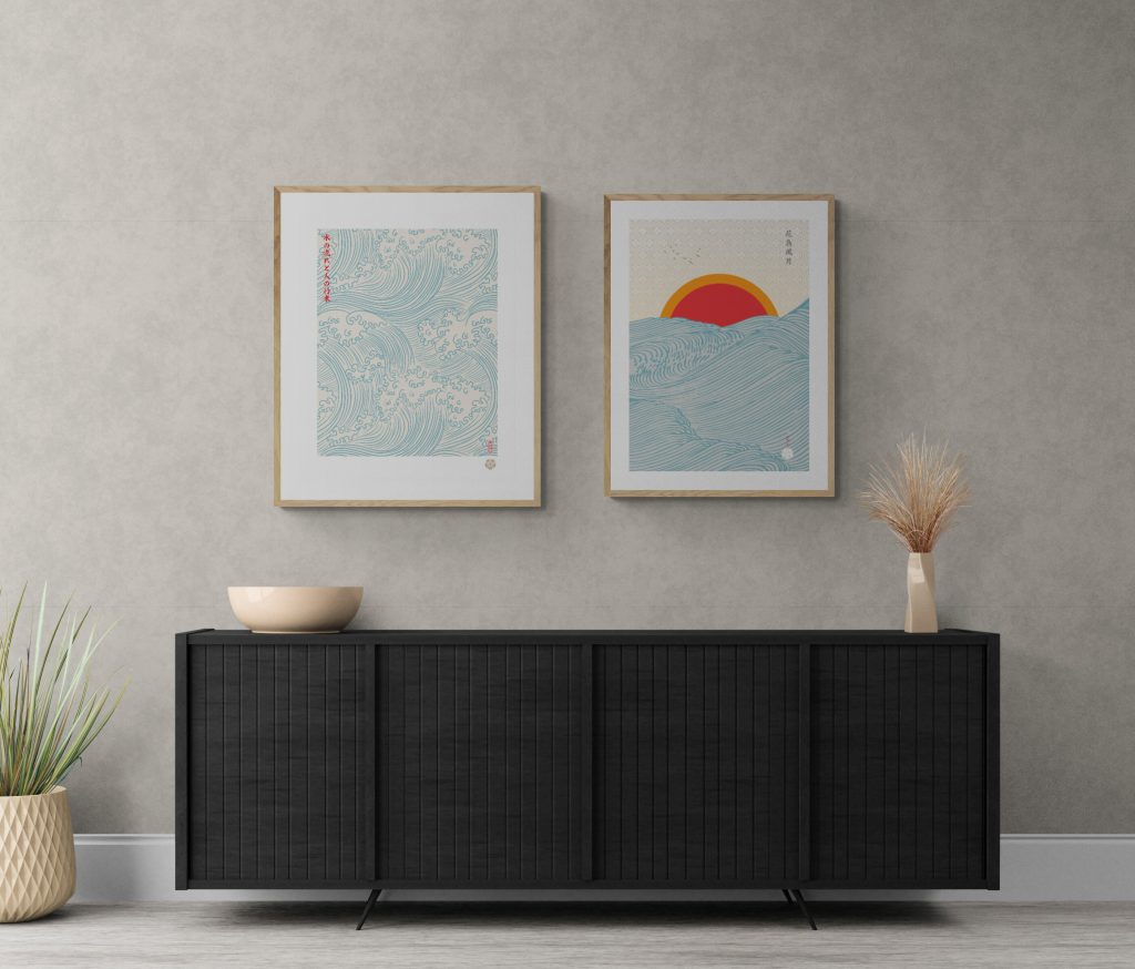
At The Art of Zen we carry a wide selection of our own hand-crafted original Japanese art prints in the ukiyo-e and Japandi style. Some of our best selling work is Mount Fuji wall art and Japandi wall art.
Add some zen to your space with brilliant original art from the Art of Zen shop.


0 Comments